|
–Geoff-Hart.com: Editing, Writing, and Translation —Home —Services —Books —Articles —Resources —Fiction —Contact me —Français |
You are here: Articles --> 2013 --> Skeuomorphism: the risks and benefits of mimetic design
Vous êtes ici : Essais --> 2013 --> Skeuomorphism: the risks and benefits of mimetic design
by Geoff Hart
Previously published as: Hart, G. 2013. Skeuomorphism: the risks and benefits of mimetic design. Intercom October:11–14.
Jon Ive, Apple’s chief designer, recently ignited a heated debate when he set out to redesign the iOS operating system that runs on Apple’s iPhone and iPad products. Contrary to expectations, the debate didn’t revolve around the features of the operating system or the lack thereof. Instead, they related to an obscure word most technical communicators had never heard before: skeuomorphism. Skeuomorphism is a form of mimetic design—in this case, creating a design on the computer screen that resembles a real-world object. The supposed problem with skeuomorphism relates to how the object appears in its on-screen representation: if a real-world characteristic doesn’t exist in the on-screen version, then from a minimalist perspective, that characteristic is unnecessary and should be eliminated. An example would be using the image of a rotary-dial phone to represent the telephone features of your smartphone; although the numbers clearly play a key role and must be preserved, the rotation feature is irrelevant and misleading and should be deleted.
Opponents of skeuomorphism carry this approach even further; they may even oppose the use of drop shadows to suggest the existence of three-dimensionality. Ironically, although Ive will banish drop shadows from iOS, he will replace it with an worse faux-3D effect that alters the background image based on the phone’s ability to detect changes in the orientation of the screen. [A look back: This and other faux-3D effects can now—belatedly—be disabled, since it turns out that the effect was actually making people nauseous.—GH]
The thing that’s generally ignored in this debate by both advocates and foes of skeuomorphism is the distinction between functionality and esthetics. Much of the heat and far less of the light comes from those who advocate simple, minimalist designs and their opponents, who prefer a “busier” visual esthetic. Conspicuously absent from the debate have been information designers and usability professionals who are willing to seek an appropriate balance between esthetics and functionality. As a result, the debate has been dominated by competing dogmas, thereby missing an opportunity to inform and improve the interface design. In this article, I’ll take a step back to gain some perspective by considering skeuomorphism from the perspective of information design principles. In so doing, I hope to provide a more objective way for you to think about whether any given form of mimetic design is truly problematic in your own work. I’ll break this discussion into the following topics:
Every information design exercise starts with a consideration of the audience. By focusing purely on the visual characteristics of a design, critics of skeuomorphism start from a highly subjective esthetic perspective: one designer’s “elegant minimalism” is another designer’s barren emptiness. The more important design criterion is whether an image will be familiar to your audience, and if not, whether they’re willing to learn something unfamiliar or will benefit enough from making this effort that they’re willing to do so. Few complex products can be learned purely by intuition and experimentation, so some learning will almost always be necessary. The goal is to use visual design to support that learning. A second and equally important criterion is whether the form clearly relates to the function.
Hardware and software examples reveal how designers have failed to understand these criteria. When I learned to drive, the mechanical knobs of a car’s ventilation system did exactly what they visually promised: if you turned the knob from the position with one fan icon to the position with two fan icons, the airflow doubled. In most modern cars, this feedback is gone, and the airflow depends on your travel speed, the engine load, and (apparently) the phase of the moon. This requires endless adjustment of the knobs to achieve a satisfactory airflow—a design with serious usability problems. The problem persists when the physical knobs are replaced with touchscreen equivalents. The music volume levels on an iPhone fail the usability test in a similar manner: a volume setting of 10 may be required to even hear one song, but may be ear-rupturing loud for another. In short, the volume setting bears no consistent resemblance to what users expect to emerge from the earphones. Rather than adopting the obvious and superior fix (making the output volume directly proportional to the volume setting), Apple added a “soundcheck” feature—a poorly considered, bolted-on fix that many users never notice and therefore never learn to use.
In a recent issue of the TidBits newsletter, Michael Cohen provided an interesting example relating to the use of footnotes in eBooks. I consider most footnotes symptomatic of lazy writing (i.e., failing to integrate information within the text), whereas most academic readers consider them important and valuable. Whichever opinion you share, attempting to preserve footnotes in an eBook creates a problematic skeuomorphism that results from failing to consider what footnotes represent and how users will use them in a given medium. In an eBook, footnotes represented by tiny and therefore unclickable numbers or symbols (such as* or †) should be replaced by hyperlinks or popups, greatly improving their utility. This means that there’s little justification for retaining skeuomorphic footnotes at the bottom of a screen that was designed to resemble the printed page. Eliminating both the footnotes and the false resemblance to a printed page would improve the usability without compromising esthetics.
Design lessons: Where skeuomorphism relies on familiarity with a physical object to ease the learning curve, as in the case of swiping from right to left to turn the page on an eBook reader, it provides a significant benefit. Where it provides no benefit or misleads the user, it should be eliminated. Where it ignores important aspects of the medium or the characteristics of a device, it should be redesigned.
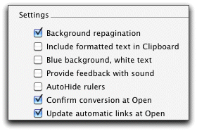
An effective design must account for both the usage context and the features of a product that will be used in that context. A key consideration therefore becomes how to provide clues that will help the user to predict how the product will respond. This is evident in the design challenge of crafting a consistent user-interface metaphor. In the Windows and Macintosh interfaces, the tools used to select one or more options provide an interesting example. A square checkbox (“choose as many options as are relevant”) strongly resembles the checkboxes found in the multiple-choice tests that most of us endured throughout our education, and therefore helps us predict its function:
Radio buttons (“choose only one of these options”) are more abstract, because few physical products use them any more:
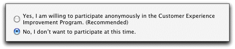
These interface options have largely replaced the on/off toggle switches that were common in the early days of interface design, which were skeuomorphic but instantly comprehensible. Nonetheless, both checkboxes and radio buttons provide consistency that guides users in selecting from among the available options once they learn the difference between the two selection options. That consistency gives users confidence that they can predict what will happen when they select these features in any dialog box.
Equally important is that both options provide feedback that helps users understand how they work. For example, if one radio button is already selected and you select another one, the software automatically deselects the first button; in contrast, selecting a new checkbox does not cause this to happen. Users quickly learn the difference between the round radio buttons and the square checkboxes. To support those who require more clues, interface designers usually complement the visual image with text such as “select one of” or “select all that apply”. This clarifies the meaning for those who need clarification, and is ignored by more experienced users who often skip the caption and and go right ahead to select options.
Design lessons: Skeuomorphism is helpful when it provides clues to consistent behavior that let users predict the consequences of actions. Abstraction is acceptable if it is supported by visual or other feedback that helps explain the product’s responses.
Don Norman first brought the concept of affordances to widespread attention in the design community. An affordance is a visual or other clue that tells you how you should interact with an object. The handle on a teacup is one such example, and many Westerners have so internalized this design that they take a moment to figure out the new “interface” when they first encounter the handle-less Chinese-style teacup. (I actually saw one colleague try to use the cup as a finger bowl!) Most of us don’t document tea tools, but we might document digital and cell-phone cameras. Most of these offer a setting that provides an audible click when the camera takes a picture. This is an auditory skeuomorphism because there is no physical shutter, visible or otherwise, on the camera, and most younger users have never encountered a camera with a physical shutter. The meaning is nonetheless clear despite the lack of correspondence with any real-world feature.
Note that this feature can generally be turned off, which preserves the utility of the feature for those who want it and disables the feature for those who don’t. That flexibility is important. [A look back: One of the serious problems with changing an interface and eliminating all traces of the old interface is that you also eliminate the skills your audience has learned in using the old interface. You have to have an awfully good reason to treat your audience with such disregard for their investment in your product. Microsoft's epic fail in replacing Word's menus with the new "ribbon" interface was not because the ribbon is inherently bad (though it's a space-hogging disaster on the screen of a small laptop): it was because they eliminated the traditional menus and forced users to relearn skills they'd mastered through years or even decades of experience.—GH]
Skeuomorphism leads to problems when, based on a resemblance with a real-world object the user knows how to interact with, it incorrectly suggests that an action should be possible. For example, it’s not possible to turn the calendar pages in the icon for Apple’s iCal software for the Mac, which resembles one of those paper desktop “day at a time” calendars that lets you tear off a day’s page when that day is over:

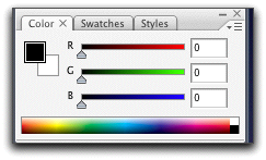
Combining the suggestion of a turned-up page corner with the user’s experience of swiping left to right to turn pages in eBook software or in the Calendar app on their iPhone or iPad results in frustration for iCal users who incorrectly attempt to apply this knowledge to turning calendar pages. (This is also an example of a significant interface inconsistency, but here I’ll focus on the problem of misleading affordances.) Slider bars to adjust settings are a useful counter-example: the bits and bytes of software have nothing that resembles a physical slider, yet the meaning of a sliding scale is so intuitive that, once learned, many people use the slider to adjust settings even when the interface allows direct input of a numerical value by typing a number in a field. Users prefer the skeuomorphism of the slider because of the (incorrect) perception that it gives them more control. For example, consider the color-definition palette in Photoshop:
Design lessons: Skeuomorphism is helpful when the visual clues provide clear affordances and the product behaves as users expect based on those affordances. When the affordances are unclear or mislead, they should be eliminated. Allowing users to turn off features that bother them balances the needs of those who benefit from a skeuomorphism and those who don’t.
One great advantage of the Windows and Macintosh graphical user interfaces is that once you learn how to control a mouse, they allow direct manipulation of objects. In most software, the onscreen objects have no real-world counterparts, so this manipulation clearly represents skeuomorphism. Yet this design provides a powerful tool when it’s necessary to push things around on the screen to (for example) move files between folders or to move objects within a graphics program’s drawing space. To the purist, this is skeuomorphism at its most egregious, because there are no paper file folders on any computer—yet to the information designer, this is effective design because the abstraction clearly emulates how users think of file storage.
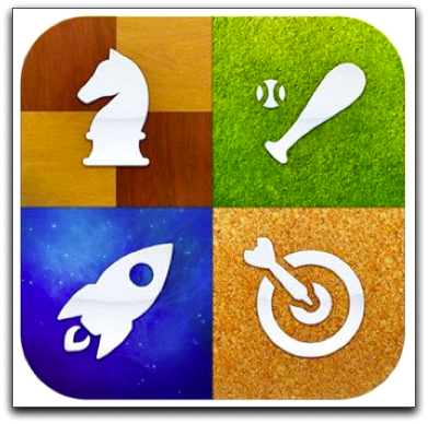
Unfortunately, many icons offer egregious examples of poorly considered skeuomorphism because most software functions have no real-world visual equivalent that can be used to represent the function. This forces designers into occasionally tortuous convolutions to come up with something visually appropriate. One solution is refer to real-world objects that are no longer common. Consider, for example, the floppy disk icon used by most software to represent the “save this document” function. Ask anyone younger than about 25 what physical object the icon represents, and they probably can’t tell you; it’s been about a decade since floppy disks were in common use. More seriously, this skeuomorphism conceals a key distinction between whether the file will be saved on a diskette, a hard disk, a solid-state drive, a flash drive, or “the cloud”. Although software users quickly learn the icon’s meaning and learn these nuances through formal training or cultural transmission (i.e., by having someone explain the meaning), the icon and many others are incomprehensible based solely on their visual content. Consider, for example, the change in the "Game Center" icon between iOS 6 and 7 for the iPad and iPhone:
 |
 |
| In iOS 6, the icon actually looks like four games grouped together. | In iOS 7, the icon looks like some kind of color-blending or graphics app. |
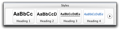
This is a sufficiently ubiquitous problem that most icons must be combined with explanatory text, such as the list of icons for style names in Microsoft Word’s ribbon:
Moreover, interface designers routinely include popup text (such as“tool tips”) to describe all icons in their interface. But this is not a benefit of the design; it’s a design failure that results from over-reliance on ineffective skeuomorphism.
Design lessons: Avoid skeuomorphism when there is no obvious correspondence between the visual representation of an interface feature and the real-world object or process it represents. Instead, provide a functional alternative; in some cases, text is the best option, and in others, you must combine text with graphics so that the combination provides multiple ways to understand.
I started this article by noting that the debate over skeuomorphism often comes down to a lack of understanding of the roles of form and function, resulting in a reliance on dogma rather than on a careful consideration of each design problem. Design principles, no matter how seemingly sensible, should always be subjected to a reality check.
Functionality is clearly most important for hardware, software, and other objects that were designed to be used rather than merely to be appreciated or experienced. But in practice, most of us are highly visual creatures who value esthetics, even though our esthetic criteria differ. This should not be ignored in an attempt to slavishly enforce a specific design philosophy such as the rejection of skeuomorphism. For example, software screenshots are often used ineffectively in documentation, yet imagine how boring and difficult to use documentation would be if it were based purely on text, with no icons or screenshots. The best designs combine form and function so that both aspects reinforce each other rather than detracting from each other. Many aspects of graphics software meet this criterion, such as when the shape and size of a paintbrush change in response to changing pressure on a graphics tablet or touchscreen.
In July 2013, “Hamranhansenhansen”, writing about the iOS redesign in the MacWorld online forum, noted that a bigger problem arises from how the interface steps between the user and what they’re trying to do rather than (more properly) fading into the background and letting the application (the activity) take center stage. Whether or not you agree with that point, it’s an important reminder that people don’t buy products to use the product; they buy products to perform tasks. From a purely practical perspective, designers must emphasize design features (including skeuomorphism) that enhance the product’s functionality, particularly in the form of providing helpful affordances. But humans are not purely practical, and elegant or even beautiful design should not be ruthlessly eliminated simply because it serves no functional purpose. So long as skeuomorphism doesn’t interfere with using the product, it’s at worst a forgivable sin. When it provides key affordances, it may even become essential for usability.
Deciding whether skeuomorphism is acceptable is not a simple binary issue of right or wrong; rather it’s a nuanced consideration of whether a visual feature is right in a particular situation for a particular audience, whether it’s sufficiently right that it requires no additional explanation, and whether a superior non-skeuomorphic alternative exists. Hippocrates’ principle (“first, do no harm”) is probably a good one to keep in mind here and in most other design challenges.
[A look back: It’s clear that much of what Jon Ive described as a usability problem to justify his redesign of iOS was nothing more than personal preference masquerading as a design principle. The Neilsen-Norman group, well-respected design gurus, had several criticisms of the new iOS 7 design.--GH]
©2004–2024 Geoffrey Hart. All rights reserved.