|
–Geoff-Hart.com: Editing, Writing, and Translation —Home —Services —Books —Articles —Resources —Fiction —Contact me —Français |
You are here: Articles --> 2008 --> Typography 101B: the role of white space in making words readable
Vous êtes ici : Essais --> 2008 --> Typography 101B: the role of white space in making words readable
by Geoff Hart
Previously published as: Hart, G. 2008. Typography 101B: the role of white space in making words readable. Intercom December 2008:29–30.
In the previous article, we looked at how line length and line spacing affected readability. In this column, we'll carry that analysis to a more micro level by examining the spaces between word and characters.
If you look closely at a page, you'll notice that your eyes only encompass a certain amount of text in sharp focus—typically no more than half a dozen letters on either side of the point where your eyes come to rest, which is known as the point of fixation. The farther an object lies from that point, the fuzzier it appears. The portion of the line of text containing your fixation point will be quite clear because it corresponds to the region of foveal vision, which represents the part of the visual field processed by the fovea, the part of your eyes that specializes in sharp detail.
Within each field of vision, your eyes use white space to recognize where each word begins or ends, and make a series of tiny subconscious movements called saccades between words or small word groups; saccade is the French word for a sharp movement. Beginning readers tend to read words a letter or syllable at a time, with more fixations, shorter saccades, and more jumping backwards to reread text; in contrast, skilled readers learn to identify individual words by their distinctive shapes, do so faster (shorter fixations), and back up less often. Because of the fundamental importance of being able to distinguish one word from the next, the spaces between words must be sufficiently greater than the spaces within words (see the next section, on character spacing) that each word appears to be a visually distinct unit. This is why, as you can see in Figure 1, text is much easier to read when the words are separated by spaces than when they are not. Although skilled readers can still pick out the words even without the spaces, Figure 1 shows why overly tight word spacing can decrease readability: the task is more difficult when the words aren't distinct. On the other hand, the space between words must not be so large that the words no longer appear to be part of the same line of type or so that the spaces appear more prominent than the words; when that happens, more saccades and back-tracking are required and reading slows.
Wordsnotseparatedbyspacesaredifficulttoread.
Words separated by spaces are easier to read.
Figure 1. Why word spacing is important. Compare the readability of the unspaced (top) and spaced (bottom) text.
As is the case with spaces between words, spaces between characters must be sufficiently small that the letters form a single visual unit (i.e., a word) rather than having each letter appear to be a distinct word. On the other hand, the spaces must be sufficiently large that the characters do not blur together, sacrificing their distinct shapes. Special characters called ligatures in professional versions of computer fonts make the problem obvious: although ligatures such as ff and fi are typographically elegant, modern readers (those who have grown up since the age of computerized typesetting) are less familiar with them, and may misread them (respectively, as a stylized capital H and lower-case h). The same problem occurs with other letter pairs that lack specific ligatures, such as nn: if the two letters fall too close together, they're easily misread as an m.
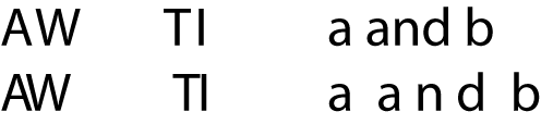
Kerning is a typographic technique based on the different internal amounts and distributions of white space in each character. When you kern, you shift pairs of characters closer together or farther apart to optimize the use of this space. If you compare a W with an A, for instance, you can see large amounts of white space under the leftmost and rightmost ( \ and / ) strokes of the W, whereas a similar amount of white space appears above the leftmost and rightmost ( / and \ )strokes of the A. In this case, it's obvious how the strokes of the A could nestle under the strokes of the W, whereas the rigid crossbar of a T prevents the letter from coming any closer to the vertical stem of an I (Figure 2).
Figure 2. Good kerning (left) efficiently retains only the white space required to separate adjacent characters, as in the AW combination; excessive kerning (center) brings adjacent letters so close they merge into a single character, as in the TI. In contrast, overly loose kerning (right) makes the spaces within words approach the size of the spaces between words.
Most modern software provides some form of automatic kerning that attempts to optimize the white space within and between letters. This information is usually embedded as a "kerning table" within a computer font file, but you can usually fix any problems resulting from a designer's injudicious choice of kerning values by means of optical kerning, in which you manually adjust the space between two letters to account for perceived changes in spacing that arise when you enlarge or shrink the type. Modern software also usually offers a tracking option that adjusts the spacing between all selected groups of characters, whether adjacent letters can easily slide closer together (A and W) or cannot (T and I). For this reason, kerning is generally more successful than tracking at efficiently using tight space without sacrificing legibility.
The problem with kerning and tracking is that if you're not careful, you can easily render an otherwise perfectly legible typeface illegible by specifying such tight kerning that the characters merge and lose their distinct identities, or by using such loose kerning that the characters within a word no longer appear to function as a single unit. Both problems compromise reading efficiency, since they make it more difficult to recognize words and to recognize that they function as single units.
As in the case of line length and spacing, many factors interact to affect optimal word and character spacing. Type size is probably the most important. Word spacing must typically increase at large type sizes. For example, the amount of space between two words in this article would clearly be insufficient with the words scaled to billboard size; the spacing must expand proportionally. Similarly, character spacing must change with type size. The standard kerning tables that accompany a font are usually designed for a specific and narrow range of type sizes, and the pair-kerning built into each font works well only for those sizes. For much smaller or larger sizes, optical kerning (which visually accounts for changes in the space between characters) does a better job of preserving legibility.
In the previous article, we explored typographic aspects related to lines of text (line length and spacing), and here, we explored aspects related to words (word and character spacing). But this is all very theoretical. What does it mean in practice? This is where we enter into the realm of typeface choice, which we'll discuss in the next article.
©2004–2024 Geoffrey Hart. All rights reserved.