|
–Geoff-Hart.com: Editing, Writing, and Translation —Home —Services —Books —Articles —Resources —Fiction —Contact me —Français |
You are here: Articles --> 2008 --> Much ado about nothing. Part I: The importance of white space
Vous êtes ici : Essais --> 2008 --> Much ado about nothing. Part I: The importance of white space
by Geoff Hart
Previously published as: Hart, G. 2008. Much ado about nothing, part 1: the importance of white space. Intercom January 2008:36–37.
Most technical communicators are writers who only occasionally dabble in graphic design, so we naturally focus on words. Yet even the most visually naïve among us recognize that the spaces between the words are equally important; after all, without those empty spaces, sentences would collapse into solid lines of letters, and letters into solid blocks of ink. Nobody would argue that such a typographic black hole represents effective communication.
The space that defines and separates is called, naturally enough, "white space", because most of the words we produce are made visible with black ink. (In practice, white space can be of any color, and a better term for it is "negative space".) The important point is how white space groups the ink on the page—or pixels on a monitor—into things we should focus on and things we can ignore. Because white space is important, we must learn how to use it consciously rather than just letting it happen. That will be the goal of my next few columns.
White space is a paradox: by definition, it contains no information, yet clearly it communicates despite that lack of content. It's what we might whimsically call "non-data, non-ink" to parody Edward Tufte's famous distinction between data ink (marks that convey meaning) and non-data ink (marks that serve no purpose). It's the visual equivalent of the number zero, a difficult concept to grasp. How difficult? Enough so that everyone's heard the classic zen koan about “the sound of one hand clapping”—that is, nothingness.
The importance of zero can't be overstated: it lets us represent the absence of something, and by extension, distinguish between absence and presence. Since even the text that we create is perceived visually, it's important to understand how this works. The field of gestalt psychology provides an important tool for understanding by defining what are called "figure–ground" relationships. If you think of ground as stemming from background, you'll find it easy to remember the distinction between it and figure, the information that emerges from that background (that "figures prominently"). In our most familiar communication medium, the printed page, the ground literally represents the page itself, which contributes the white space around the information that we display on that page. You can understand the importance of that white space by performing the following thought experiment: Replace that whiteness with black ink, and imagine how the figure (the text on the page) would disappear into that background.
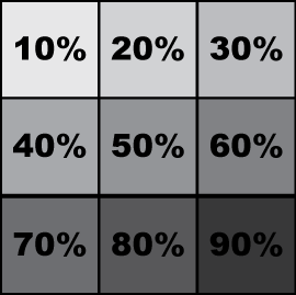
This leads to the first lesson of white space: whatever its actual color, information can only be visible if it contrasts sufficiently with its background for the human eye to detect it. In Figure 1, for instance, the text appears as undiluted (100%) black ink; as we decrease the contrast between it and the background by adding increasing amounts of black to the background, the text gradually becomes more difficult to discern. Although it remains legible against a background of 80% black, the difficulty increases significantly at values greater than 50%. This example illustrates why books are generally printed in black ink on white paper: this maximizes the contrast between the text and its background, making the two easier to distinguish.
Figure 1. Examples of different degrees of contrast between the figure and the ground.
When we design visual images, including pages of text, the contrast must be sufficient that the figure is easily distinguished from the ground. This is also true in color, but with additional complications. For example, color-blind viewers may be unable to distinguish between certain colors based solely on differences in their hue. Up to 10% of North American men suffer from red–green colorblindness (an inability to distinguish between the two colors). If these two colors form the figure and the ground, the two potentially become indistinguishable. See, for example the WikiPedia illustration of red–green colorblindess. But if you change the relative darkness of the two colors (their "value" component in graphics jargon), the two may still remain distinct. To test whether you've succeeded, print the color image on a monochrome laser printer; in the absence of color, it won't be possible to easily see the figure if it doesn't contrast sufficiently with the ground.
Words and images use white space differently. Body text consists primarily of small patches of ink (words and lines of words) separated by larger expanses of white. Manufacturers of inkjet cartridges typically claim that a text-only page represents as little as 5% ink coverage, suggesting that the remaining 95% is white space. In contrast, photographs can cover 100% of a page with ink, though images such as a black cat standing against a white wall still contain considerable amounts of white space—both in the literal (color) sense and in the gestalt sense of separating figure from ground.
Pages that contain both graphics and text lie somewhere in between. Seen from a distance, blocks of body text appear as relatively homogeneous patterns of light and dark, whereas photographs resemble discrete areas of solid ink coverage, often with a strong border; both properties separate them visually from the surrounding text (Figure 2). Headings have aspects of both text and graphic: clearly, they are composed of words, but they appear semi-graphical because of their size and boldness, the surrounding white space, and possibly the presence of color bars around the text, as in the version of this article that appeared in Intercom. Similarly, line art can appear closer to text than to a photograph because lines and hollow figures such as circles are surrounded by and contain relatively large areas of white space.
Figure 2. Differences in white space within a page. Note the lack of white space within the photo, the balance between ink and white space in the lines of text, and the abundant white space around display text (the quote, title, and headings) and between the columns.
White space within graphics also separate their various textual and graphical elements. For example, in illustrations labeled using callouts, the image typically occupies a central position, whether physically (at the center of the image space) or visually (at a position of emphasis). As a result, the image's purely graphical components lie at its center (the illustration itself), surrounded by graphical elements (arrows), with an outer ring of text attached to these arrows. Other images group and separate their elements differently using white space. For example, bar charts have a "data" component (the bars); hybrid elements such as the graph axes, which combine graphical characteristics (length and thickness) with textual elements (numbers and words), and a key that combines graphics (colors or patterns) with text that explains those cues.
A well-designed graphic separates these components so that each one's distinct function (e.g., content versus explanation of content) are apparent. At the same time, excessive separation conceals the relationships between components. For example, the key that defines the colors or patterns used to label different classes of information in a bar chart or the lines in a line graph uses white space to separate these explanations from the image they explain, but the key remains sufficiently close to the image that viewers can see both the image and its explanation side by side. This is more effective than forcing readers to switch their focus back and forth between the figure caption and the graphic to extract the meanings of the patterns from the text, but less effective than directly labeling the bars or lines, thereby eliminating the need to glance across the intervening white space that separates the patterns from their explanations.
White space springs into existence even when we don't intentionally create it, creating the many effects described above. In future articles, I'll dig deeper into how to make white space work for you.
Anon. 2007. Gestalt psychology. http://en.wikipedia.org/wiki/Gestalt_psychology
Schriver, K.A. 1983. Dynamics in document design. Wiley, New York.
©2004–2024 Geoffrey Hart. All rights reserved.